Sonos Arc Ultra
Home Theater Soundbar

The Arc Ultra’s user interface is a harmonious blend of form and function, providing an intuitive and robust experience that exudes a sense of calm and elegance.
The Challenge
Redesign the user interface on Arc Ultra, Sonos’ successor to the highly acclaimed Arc soundbar, to enhance its usability and increase its usage compared to its predecessor, the Arc soundbar.
The Outcome
The new flagship soundbar, Arc Ultra, features an innovative, intuitive and visually appealing user interface that’s a pleasure to use.
The Experience
You have a few close friends and their children visiting you for lunch on Sunday. Since it’s been a few weeks since you last tidied up, you’ve decided to give the house a quick clean and make it a bit more inviting.
Since the task you’re about to undertake isn’t particularly enjoyable, you put on some upbeat music on your Arc Ultra to set a positive mood. It truly works and gets you started.
As you make good progress cleaning the living room, you dance to the beats of your favorite songs from Michael Jackson’s Thriller.

Now, your most favorite song, “Beat It,” is playing, and you want to crank up the volume instantly. So, you quickly reach for the volume control on Arc Ultra and make a quick finger slide through the volume control. You appreciate how effortlessly and enjoyable it is to adjust the volume using that user interface.

It’s Sunday noon and your friends with their kids have already arrived. Have a nice lunch and have a pleasant conversation afterward. As you all engage in conversation, the voice assistant on Arc Ultra unexpectedly activates. In response, you swiftly make your way to the soundbar and press the Voice Control button on the user interface to temporarily disable the voice assistant.

A few minutes later, you realize that the TV is extremely loud. Upon entering the room, you discover that the kids had accidentally turned up the volume on the TV remote. You couldn’t find the remote control, so you resorted to the volume control on Arc Ultra to lower the volume. You kindly asked the kids to keep the volume low and leave.
After a few hours, your friends express their gratitude for the wonderful meal and enjoyable time, and then they bid you farewell.
The Design Process
Symptoms
Sonos has been leading the premium home theater soundbar market in the US, UK and Germany since the launch of its flagship Dolby Atmos soundbar Arc in the year of 2020.
But in the couple of years since Arc’s launch, the competition was intensified. Sony and Bose, Sonos’ key rivals, introduced their versions of Dolby Atmos soundbars in the same segment, which were eating into the Arc’s market share.
To maintain its market leadership, Sonos had to react and refresh the Arc with new features and an
improved user experience that outperforms the competition.
Problem Identification
The core project team, which included myself, spent about four months identifying the problems and areas for improvement in their respective disciplines of industrial design, sound experience, user experience, and product marketing.
In this phase of problem identification, I performed following activities:
-
Competitive analysis: Tested the competition, particularly the Bose Soundbar 900, and identified the areas where Arc fell short compared to its competitors.
-
Usability testing: Conducted a couple of rounds of usability study with a colleague and a family member to gather their perspectives.
-
Experience principles: Mapped the user experience Arc delivers with our benchmark for an ideal home theater user experience and with the Sonos experience principles.
-
Portfolio parity: Determined the position of Arc within Sonos’s portfolio, as well as the changes or improvements that have occurred in Sonos’s portfolio since Arc’s launch.
In this process I closely worked with the product manager, user researcher, data scientists and customer support team to extract the desired information from the database.
To pinpoint the issues, I sought information from the following sources:
-
Product brief
-
Testing results of Arc and the competition.
-
Arc’s beta survey results
-
Telemetry
-
Usability study findings from when Arc was being developed
-
Customer reviews on the Sonos website, Best Buy, and Google.
-
Customer feedback as recorded by Sonos’ customer support team.
-
Sonos sustainability guidelines
-
Evolution of the Sonos product portfolio
-
New products in development that would influence the new soundbar
Pressing Issue
The research yielded numerous key insights, but one of the pressing issues was that the user interface on Arc was too complex to use.

The Sonos Arc soundbar’s user interface features a zoomed-in view of the playback controls and status light. The playback controls consist of three capacitive touch buttons.
Research findings related to the on-product user interface suggested that the user interface on Arc, commonly referred to as the Signature Details UI or Sig Detail UI, seemed counterintuitive to many users. Many users believed that the buttons on the user interface, except for the Play/Pause buttons, were merely decorative elements.
Users expressed dissatisfaction with the existing UI model, as they were not able to figure out the function of certain UI elements. Consequently, the adoption of the UI was low, and users resorted to the mobile app to control the speaker.

A test participant is trying to control music playback on the Sonos Arc prototype during a usability study.
The exact research findings were as follows:
Play/Pause:
-
It is clear that this icon indicates play and pause (intuitive)
-
Play/pause is easily recalled after first use
4 dots:
-
Without any interaction, the 4 dots are assumed to be volume buttons - mostly based on the location which has an affordance for volume
-
When people interact with these buttons, it is clear that these are volume buttons based on the sound tone getting higher and lower, and the audio content volume getting higher and lower
-
The dot icons are easily recalled after first use
Next and Previous Track:
-
Low discoverability. Customers have to be made aware of this feature.
-
Think it is odd to have to swipe over the Play/Pause icon to go to the previous/next track. When asked how they would swipe to get to the previous or the next song, it is common for people to do a small swipe over just the 4 dots.
-
The swipe is very finicky. People often forget exactly how to swipe (low recall), and often fail on the first attempt.
-
It is common for people to accidently activate the play/pause button during the swipe.
-
It is difficult for people to get both the swipe touch target right + their finger pressure.
-
This is all often true even after first time use.
The user sentiments voiced in the qualitative findings from user study reflected in the Arc telemetry as well. The telemetry data revealed that the volume change along with the next and previous track incurred significantly less usage as compared to the play/pause functionality.

30 days telemetry data showing the usage of the various user interface elements in Sonos Arc.study.
Root Cause
Based on the user feedback from the Arc user study and my evaluation of the user interface design, I identified the following as the primary reasons for the low adoption of the Sig Detail user interface on the Arc soundbar:
-
Intricate user interface with steep learning curve:
-
Over the decades, users have developed a well-established mental model for playback control functionality. This model is based on the use of various audio devices, from old cassette players and CD players to the most recent MP3 players and music apps on smartphones. All these devices have provided users with an interface that features dedicated controls for each playback control function, including Play/Pause, Next Track, Previous Track, and Volume Up/Volume Down. The graphic icons used to represent each function on the traditional playback control UI have also become a standard.
-
Arc employed a unique UI model with only three capacitive touch buttons, each capable of performing multiple distinct functions, six in total. Consequently, certain UI elements had multiple purposes that users needed to learn and remember. This was only feasible if the user interface was used daily multiple times throughout the day. Since users didn’t use the user interface on Arc daily, they couldn’t grasp the unique UI model.
-
-
Non-standard graphics:
-
Many users failed to comprehend the novel interaction model on the Arc because the UI lacked the use of standard icons, except for the Play/Pause icon.
-
-
Insufficient affordance:
-
The icons with four dots, which used to represent volume up and down functionality, were abstract and appeared as decorative elements hence lacked call for user attention.
-
-
Lack of signifiers:
-
There were no signifiers for swipe gestures used for next and previous track functionality.
-
-
High cognitive load:
-
The user interface (UI) model heavily relies on recall rather than recognition, which leads to an increased cognitive load when users attempt to use the UI. Consequently, users become less likely to use the UI.
-
-
Availability of alternate options:
-
Ultimately, users turned to the Sonos app to control the playback, despite their complaints about its inconvenience. This was because the mobile app often made simple playback control tasks difficult.
-

The gestures supported on the Sig Detail playback control UI on Sonos Arc.
Designing a Solution
The insights I gained from the research helped me formulate the high-level user experience requirements for Arc Ultra user interface, particular the playback control UI, which are as follows.
-
Designate a UI element for a specific function:
-
Follow the established playback control standard, unless there are any issues with it.
-
Assign separate UI elements for each of the playback control functions which are: Play/Pause, Next Track, Previous Track, Volume Up, Volume Down
-
-
Offer more control:
-
Introduce the fast forward and fast rewind functionality which lacked in the older UI model.
-
Retain volume ramp up and ramp down functionality.
-
-
Keep the UI decluttered:
-
Instead of adding more buttons for the fast forward and rewind functionality, integrate these functions into the next and previous track buttons.
-
If possible, combine volume up and down buttons to appear as a single unit.
-
-
Make the UI recognizable:
-
Use the standard graphic icons for all the playback control functions.
-
These requirements would be additional to the Sonos Experience Principles that the new design must adhere to. The experience principles are: Easy, Connected, Joyful, Signature, Curated and Premium.
Mapping Use Cases with UI Elements
After reviewing the playback control user experience requirements with the broader design team, I shifted my focus to the other use cases that necessitate additional on-product controls and indicators. The design brainstorming commenced after thoroughly analyzing all the anticipated use cases for the user interface on Arc Ultra and compiling a comprehensive list of UI elements that must be integrated into the on-product user interface of Arc Ultra.
Following table shows all the use cases that require a control or an indicator on the hardware. The use cases are formatted to cover the user situation (When…), user expectation (I want…) and user benefit (So that…):

Building UI Architecture
After building the UI inventory, the next step was to start designing the UI which includes creating various layout options and deciding the type of UI element to use.
To begin designing, the most crucial aspect was identifying the available user interface elements on the form’s new features. To identify potential surfaces for UI placement, I collaborated with the industrial designer and analyzed the Arc Ultra form factor.
Upon careful examination, I discovered that the new form factor presents two distinct surfaces, Top Surface and Rear Surface, each with unique characteristics and associated advantages and disadvantages. Based on their characteristics as listed below, the surfaces could be renamed as the Primary UI surface, which was the top surface, and the Secondary UI surface, which was the rear surface.
Soundbar surfaces feature areas designated for the placement of user interface elements.

-
Primary UI surface (top surface):
-
Always be visible
-
Easily discoverable
-
Conveniently accessible
-
All the UI elements on this surface can be capacitive touch which is was a my preference for the purpose of ease of use.
-
-
Secondary UI surface (rear surface):
-
Hidden from view,
-
Require prior knowledge of what controls are located there
-
Require time, and patience to discover the UI
-
Easily accessible in various scenarios
-
The UI elements on this surface will need blind interaction which means the capacitive touch controls could not be used on this surface in order to avoid accidental triggers during blind interaction. This means all the controls on this surface must be mechanical controls.
-
The discovery of two UI surfaces would help in determining which UI elements would go on which surface. The decision of dividing UI elements between two different UI surfaces was taken based on the potential usage patterns of various UI elements.
To design a user interface layout that feels well laid out to the majority of users and performs optimally in various scenarios, I began by categorizing the UI elements into two main groups. The division was based on the various use cases related to music playback, voice control, Bluetooth pairing, and microphone-related privacy concerns. The main factors I considered were:
-
Frequency: How often is the feature used?
-
Importance: How important is this feature in terms ease and speed of navigation? What level of user dissatisfaction would result if the feature was not easily discoverable? What are the chances of users not able to achieve the desired outcome on the product if the feature is not discovered?
-
Alternative: Are there alternative methods to achieve the desired result if the feature is not visible on the user interface?

The exercise resulted in the following user interface groups:
A. Frequently used UI (to go on the primary UI surface):
-
Status light
-
Play/Pause button
-
Next track button
-
Previous track button
-
Volume up/down slider
-
Voice control on/off button
-
Voice control status light
B. Rarely used UI (to go on the secondary UI surface):
-
Bluetooth pairing button
-
Microphone on/off switch
UI Element Selection
To ensure a user-friendly experience regardless of the UI surface, it was crucial to select the appropriate UI elements for each surface. I considered following factors in selecting various UI elements:
-
The type of controls and indicators used on the previous soundbar, Arc, with their pros and cons
-
The type of controls and indicators used on the other existing Sonos products
-
The type of controls and indicators used on the Sonos products that are being developed
-
The type of control best suited for blind interaction
These factors helped identify the UI elements that could be used off the shelf as well as the ones that require new design and development.
The type of UI elements which I decided to retain from old Arc soundbar were:
-
Capacitive touch controls for playback and voice assistant
-
Multi-color status light for UI and other general purpose feedback
-
Voice control status light for voice assistant feedback
The primary reason for retaining the UI elements from the old soundbar to Arc Ultra was that they functioned exceptionally well on that soundbar. Users found the capacitive touch controls for various functions easier to use, and the behavior of the status lights was easy to understand.
It was also decided to restrict the use of capacitive controls to the primary surface and employ mechanical controls on the secondary surface. This way, users can touch and feel the controls before activating them during blind interactions. This implies that the Bluetooth pairing control and microphone control will have to be mechanical controls.
While exploring the other Sonos products in development, I stumbled upon a new UI element that was nearing completion. This unique UI element, a capacitive touch slider with embedded touch buttons, was being developed as a new volume control mechanism. It was to keep this as a strong candidate for the volume control UI on Arc Ultra.
As a result, the new UI inventory for Arc Ultra was as follows:
-
Status light (RGBW LED)
-
Play/Pause (capacitive touch button)
-
Next track (capacitive touch button)
-
Previous track (capacitive touch button)
-
Volume up/down (capacitive touch button or slider with embedded buttons)
-
Voice control on/off (capacitive touch button)
-
Voice control status light (white LED)
-
Bluetooth pairing (mechanical button)
-
Microphone on/off (mechanical switch)
UI Layout Design
Primary UI:
I created a few different layouts options for the primary UI that seemed suitable for the proposed soundbar form factors and worked with industrial designer to evaluate them.
Six distinct UI layout options were designed for the primary surface of the product. Each option has its advantages and disadvantages in terms of usability and aesthetics. A common thread among these options is that the Play/Pause button is always centered on the product and aligns with the Sonos logo on the front side, which is a valid portfolio requirement. This design is consistent with all Sonos products that feature a Play/Pause button, as users have found it very helpful in initiating music playback.
My preference was for the stacked layout for all-caps touch controls that would reside on the primary UI surface, making it user-friendly and aesthetically pleasing. However, unfortunately, the soundbar lacked sufficient vertical space on the top surface to accommodate such a layout. The primary reason for the limited space for the UI was the presence of up-firing speakers in Arc Ultra, which required perforation on the top side.
An alternative design I proposed was to utilize the elongated layout by grouping cap touch UI elements into functional clusters and distributing those clusters across various zones on the primary UI surface of the soundbar.

The primary user interface (UI) surface is divided into three distinct zones: the Center zone, the Left zone, and the Right zone. The Center zone houses the playback controls for Play/Pause, Next Track, and Previous Track. The Right zone features the volume control, while the Left zone includes the voice assistant control, along with a light that indicates the voice assistant’s status.
The division of the primary UI surface into three zones was inspired by the scientific principles governing human perception and discovery when encountering an object with scattered details across its width. As humans typically look at any object right in center, the most important controls were placed in the Center zone so that those controls are easier to discover.
Approximately 70% of the population are right-eye dominant 29% left-eye dominant, also studies suggest that approximately 90% of people are right-handed. So, when users will approach the soundbar, the Right zone will be easier to discover and access as compared to the Left zone. Another important and frequently used UI element for volume control is placed in the right side zone. The Left zone is reserved for the rarely used controls and indicators, including the voice assistant control and status light, which are expected to be used infrequently.
Secondary UI:
While the capacitive touch UI on the primary surface turned out well, the UI on the secondary surface, located on the rear side of the soundbar, was still being debated, particularly due to the placement of the Bluetooth button there.

The secondary UI design features a Bluetooth button and a microphone toggle switch located on the rear side of the soundbar.
Microphone Switch:
The secondary UI surface would feature a mechanical switch that users can use to disable the microphones built into Arc Ultra.
This is because some users may not want to use the microphone base features, such as voice control or Chirp sensing, due to privacy concerns. Research indicates that users typically make a decision about whether to keep the microphones on or off during the initial setup process.
Additionally, once the decision is made, users rarely change it, which means the switch is rarely used once it’s set to on or off at the time of setup.
These insights were enough for me to conclude that the microphone switch can be safely placed on the secondary UI surface.
Bluetooth Button:
On the other hand, the decision to place the Bluetooth button on the secondary surface proved to be a controversial one.
Bluetooth on Arc Ultra was supposed to be the last resort to stream music for following reasons:
-
It already provided numerous other methods for streaming high-quality music to it.
-
Limited bandwidth on Bluetooth Classic posed a limitation from the perspective of sound quality.
Additionally, using Bluetooth for TV connectivity was strongly discouraged because it could cause lip sync issues due to the high latency associated with Bluetooth-based streaming.
For these reasons the UX goal was:
-
To provide users with the option to stream content over Bluetooth, without encouraging or advertising it.
-
Encourage users to opt for alternative streaming options like AirPlay, Sonos app, Spotify Connect, or HDMI whenever possible.
To achieve these goals, it was crucial to keep the Bluetooth button required for pairing a new Bluetooth device out of sight in normal circumstances. This necessitated placing the Bluetooth button on the secondary surface.
The concerns were raised during several design reviews around lack of discoverability of the Bluetooth button placed on the secondary surface. While those concerns were valid, the design was intentional. The feature had lower priority on the product, was expected to be rarely used, and using it over other competing features could have been detrimental to users.

The graphic illustrates various connectivity options available on Arc Ultra, enabling users to stream content to the device. The distribution of streaming options based on usage suggests that Arc Ultra is expected to have lower Bluetooth usage.
Nonetheless, to minimize the risk of some users never discovering the feature on the product, I opted to provide users with the ability to use the Sonos app to initiate Bluetooth pairing with Arc Ultra.
Early Prototyping and Testing
Functional prototypes of the proposed UI layouts were built in collaboration with the in house prototyping engineers.

Three of the total five functional prototypes that were built are setup for the usability testing.
The user researcher conducted a 90-minute test session with six external participants from diverse demographics. During the session, participants were asked various questions about their TV watching and music listening habits, aesthetic preferences, and general lifestyle. Additionally, they were given tasks to perform using the soundbar prototypes in various real-life scenarios, such as watching TV, listening to music, and moving around the room. These scenarios aimed to simulate how users would interact with the user interface in everyday situations.

Six external participants tested five different UI design options, which were 3D printed, and provided their feedback. The user study was conducted at the Sonos facility, where participants were invited to test the early design and provide feedback.
Test findings:
The testing yielded the following important findings:
-
Participants were concerned the stacked volume control would be hard to use
-
Can't see/too close to transport controls
-
Participants perceived further forward controls as easier to use
-
How the prototype looked heavily influenced participant preferences
-
Attraction to symmetry, centered UI
-
Some usability appreciation: forward UI, fewer UI groups, tactility of volume control
-
Most perceived volume trough as modern, promising greater control
-
Participants also valued being able to use it without looking
-
A few preferred the simplicity of volume buttons
After synthesizing the findings, I arrived at the following takeaways for each design:
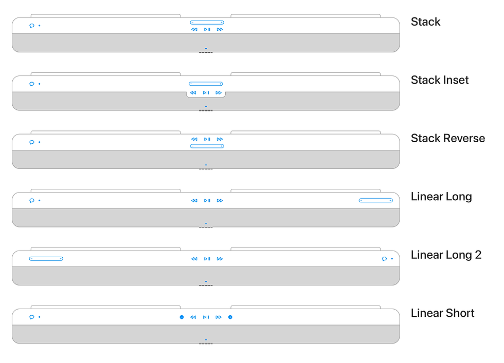
Stack: Symmetrical, clean, intuitive but usability concerns with stacked trough
Stack Reverse: Symmetrical, clean, intuitive but play/pause control feels difficult to reach
Linear Long: Volume control easy to use but two UI areas means thinking about where stuff is
Linear Long 2: Same as liner long except volume control on the left felt awkward to use due to being on the left hand side
Linear Short: Simple, clean, intuitive but need to look at buttons closely to tell apart
After further brainstorming and discussing the pros and cons of each layout with the industrial designer, we realized that there wasn’t a clear winner. Therefore, we decided to proceed with the Linear Long layout because it feels logical, works well from a usability perspective, and appears to be purpose designed for the soundbar form factor.
Design Refinement
While I was happy with our conclusions I still had some concerns with the chosen layout. On that design, while the division of the UI surface into three separate zones and the placement of UI elements within those zones appeared logical and worked as expected, there were still some usability and engineering challenges associated with this approach
.
The design related issues were:
-
The user interface appeared visually broken because the related elements were distributed across the surface of the soundbar.
-
Some users also encountered problems with the discoverability of the user interface since it appeared lost on the large soundbar surface.
-
Users had to remember and recall the location different UI elements, which could be challenging considering the infrequent use of the UI on soundbars. This meant that users would have to deal with a higher cognitive load when using the UI, which could potentially prevent them from doing so.
-
Distributed UI required users to navigate across different UI zones when they need to access two UI elements located in separate zones. For instance, imagine skipping a song during playback and adjusting the volume for the next song. This would result in increased interaction costs, including more time and effort required to engage in such interactions.
The engineering overhead involved using the electrical wiring that spans the width of the soundbar to carry the signal from the UI zones to the CPU.
In order to resolve the design related issues, I proposed following solutions:
-
Reduce the distance between the three UI zones so that the UI elements come closer to each other leading to improved usability and reduced wire lengths.
-
Design a new form factor with a dedicated, instantly recognizable, surface where all the UI elements can reside and be easily discovered.

The are the couple of ideas I suggested to the industrial designer to create a dedicated UI surface that would aid in the discoverability of the primary user interface. The variations are designed to ensure that the user can see the UI even when standing a bit farther away from the soundbar.
I once again collaborated with the industrial designer to come up with a few more form factor ideas of which one that seemed aligned with our industrial design principles was chosen to move forward with. The principle we both agreed on was that the user interface should not be visible while watching TV, but it should be easily discoverable when standing near the soundbar.

The new design features a dedicated area on the rear side of the top surface, called the UI Ledge. This UI Ledge houses all the primary UI elements and the related electronics underneath.

The UI Ledge has voice assistant control and status indicator is placed on the left hand side.

The UI Ledge has playback controls located in the center.

Volume control slider is placed on the right hand side.
The new form factor, with its updated design, possessed several key attributes.
-
The chosen form factor would include a dedicated UI surface, known as the UI ledge, for the primary UI. This surface would resemble a purpose-built surface for the UI, making it instantly discoverable while nicely blending into the overall product aesthetics.
-
The UI ledge was significantly shorter in length, measuring approximately two-thirds of the total product length. This reduction in the UI’s length would also lead to a corresponding decrease in the length of the UI zones, ultimately bringing the UI elements together.
-
Reducing the distance between UI elements results in lower costs associated with running electrical cables beneath the UI.
-
The low-profile and backward-positioned UI ledge would remain hidden when users are watching TV. However, it would become visible when they stand near the soundbar with the intention of using the UI.

The new design reduces the width of the user interface surface to approximately two-thirds of its previous width, which will enhance the overall usability of the primary user interface on Arc Ultra.
The new form factor’s attributes would mitigate the perceived risk of the Linear Long UI layout by making the user interface instantly discoverable, easier to use, and aesthetically pleasing.

The animation demonstrates how the user interface on Arc Ultra would remain out of sight while the user is watching TV and would be revealed when the user stands near the soundbar.
The design received immediate positive feedback in reviews and was promptly released for 3D printing, allowing for further review and testing.
Testing the Refined Design
A few design variation were 3D printed and physically reviewed. The variations in the prototypes were mainly related to the industrial design with changes in geometry and surfacing of the UI ledge.

The new design was 3D printed and presented to the broader design team and the key stakeholders. Several variations of design prototypes were created, each with a different size for the main speaker body and a unique geometry and surfacing for the UI ledge.

One of the prototypes was hung on a fake wall with a cardboard cutout in the size of a 50-inch TV to observe how the design appears and functions when mounted on the wall.
The feedback from the rest of the design team was overwhelmingly positive, so we conducted another round of usability study to gather further unbiased feedback from external users before we fully commit to the design direction.
In order to get realistic feedback from the user testing, a low fidelity functional prototype was also built along with the 3D prints. The test included following prototypes:
-
3D printed model with complete concave ledge that had simple integrated slider
-
3D printed model with flat ledge with volume trough slider
-
Functional prototype with old design with no UI ledge
-
Functional prototype with UI ledge


Test prototypes being set up by me in the user research lab for the UI ledge usability testing. 3D printed models were used in usability testing with two different designs of UI ledges: a concave one and a flat one.


A functional prototype of the UI ledge design setup for usability testing. A test participant is using the new primary user interface design on the Arc Ultra functional prototype.
In the second round of usability which was conducted by a user researcher, total eight participants tested the 3D prints as well as functional prototypes. The summary of the feedback was as follows:
-
Both the trough and slider volume controls have their advantages and disadvantages aesthetically; the trough overall feels easier to use.
-
The ledge design felt sleek and nice to most participants and was more usable as compared to the no-ledge design.
-
The concave surface felt nice when using because it guided the finger to the controls.
-
Volume is one of the most common controls used on soundbar hardware UI.
-
The rear-rounded ledge blended nicely into the back of the speaker; the fully rounded ledge looked more separated.
-
There were no major issues with wall-mounted UI Ledge.
Overall, the test participants expressed their satisfaction with the user interface, noting that it was easy to discover and use due to its well-organized layout.
They appreciated the fact that the user interface is not distracting while watching TV because of its location. Additionally, the volume control being on one side is helpful when trying to change the volume level while kids are watching TV.
Secondary UI Controversy
While the design was looking great, and I, along with the industrial designer, were preparing for the major milestone in the program where the design would be finalized after presenting to all the stakeholders and would be released to make the high fidelity appearance models, some concerns was raised by the key stakeholders regarding the location of the Bluetooth button.
The concerns revolved around the discoverability and accessibility of the Bluetooth button, which is hidden on the secondary surface in a standard installation scenario.

Bluetooth button and Microphone switch located on the secondary surface Arc Ultra.
The original decision to keep the Bluetooth out of sight was taken after carefully analyzing the significance of Bluetooth and its advantage and disadvantages as compared to other streaming options Arc Ultra would offer.
Previous usability tests had demonstrated that the button is easily accessible, regardless of whether the soundbar is placed on a credenza or mounted on a wall. Therefore, I was not too worried about the concerns about accessibility. However, since the discoverability aspect of the Bluetooth button was not tested the stakeholders requested to conduct a study and ensure we’re taking an informed decision. So, decided to conduct another user study specifically to test the discoverability and accessibility of the secondary user interface.
Testing the Secondary UI
For this user study, we didn’t have a researcher available, so I had to conduct it myself. Since we were almost done with the design phase, the study had to be quick and efficient so that we hit the program timelines as much as possible.
I consulted with the user researcher, and we agreed to conduct it with internal employees. The recruiting criteria were that the participants must not be from the product design and development background.
I developed a test plan with the specific goal of answering the following questions:
-
What is the user’s mental model regarding the use of connected (IoT) devices?
-
What is the user’s mental model regarding streaming music or other audio content from various devices to the smart speakers and soundbars?
-
What is the user’s mental model for pairing and connecting their Bluetooth devices such as smartphones or computers to their Bluetooth enabled speakers?
-
Can users find the Bluetooth button on the Arc Ultra without any assistance?
-
How will users know if Arc Ultra has Bluetooth and how to use it?
-
What will users do if they can’t determine whether Arc Ultra has Bluetooth with a pairing button on the product?
-
What are their thoughts on the ability to pair Bluetooth devices from the Sonos app?
-
Are they able to use the Bluetooth button on the product without any issues, once they know where it is located?
After the test plan was reviewed by user researcher, six participants were enrolled in the study. The user research lab was setup with two Arc Ultra prototypes installed in two ways, wall mounted under a TV and placed on a credenza.

In the user research lab, two prototypes of Arc Ultra are displayed: one is mounted on the wall beneath the TV, while the other is placed on a credenza.

Test participants were tasked with performing the tasks and locating and using the Bluetooth button on the Arc Ultra prototypes.
The test results were predominantly positive, which are as follows:
-
Most participants expressed their appreciation for Arc Ultra’s Bluetooth feature, but they acknowledged that it would be their last resort for music streaming since Arc Ultra offers other easier ways to stream music which are mainly AirPlay and Spotify Connect.
-
Most participants mentioned that they would already know that their soundbar has a Bluetooth feature because someone else in the family had done all the research and purchased the soundbar. They would be excited when the new soundbar arrives and try to figure out all its features.
-
Some participants found it challenging to locate the Bluetooth button on their own, so they had to resort to Google for assistance. However, once they discovered its location, they expressed their gratitude and stated that they would never forget it.
-
Some regular users of the Sonos app mentioned that they would prefer using the Bluetooth pairing feature from the app instead of the physical button.
-
All participants successfully paired a new device using the Bluetooth button in both scenarios: when the soundbar is wall-mounted and placed on the credenza.
-
All participants suggested hiding the Bluetooth button to keep the primary UI surface clutter-free and maintain pleasing aesthetics.
-
All participants expressed their preference for the placement of controls. The most frequently used controls are positioned on the primary surface, while the less frequently used controls are concealed on the secondary surface.
These findings helped alleviate concerns about the placement of the Bluetooth button. The design was eventually approved for development.
Development Refinements
During the development phase, several refinements were made to the UI based on the outcome of UX and ID validation after each engineering build. These refinements included:
-
The length and depth of the volume control was changed in order to improve tactility and comfort during the usage.
-
The size of the cap touch sensor under playback controls was refined so that it’s easier to perform Play/pause interactions.
-
Length and height of the UI ledge was changed based on the changing dimensions of the underlying electronics and heat dissipation requirements.
-
Dwell time of the UI elements was changed in the software in order to in increase the sensitivity of the volume control and voice control to compensate for the delay in touch sensor signal transmission caused by the far away location of the control from the signal procession chip.
-
Brightness of the status LED was refined for optimal experience during light and dark room environments. Different color values were used for each hue to simulate the change in brightness level.
-
Arc Ultra was developed in two colors, black and white, so the color contrast of its UI icons was adjusted to ensure legibility on both colors.

The electronics schematic displays the playback control user interface, featuring play/pause, next track, and previous track controls. Notably, the size of the most frequently used play/pause control is larger than the next track and previous track controls.


Three variations of the UI ledge design were created, each with a different height (from the top view) or width (from the side view). These variations were 3D printed for usability testing. The height and width of the ledge determine how easy or difficult it is to tap a UI control in a hurry.

Variations of the prototypes from the final builds were modified to tune the UI dwell time and test the sensitivity of UI controls. The prototypes differed in the type of electronics used to address the radio frequency interference issues that caused UI malfunctioning during a functional test.

The table presents different color values used for the status LED to provide various use feedback in different situations. By default, the LED is set to the respective hue at its maximum brightness. However, the adjusted values are tailored to suit various lighting conditions and both black and white SKU.
Final Design in Production
The design was successfully developed, and the production version matched the intended design. The final round of UX validation was conducted on the production version, and no post-release UX issues were discovered.


Impact
Arc Ultra, which went on sale in the fall of 2024 for $999 (see Arc Ultra for sale on Sonos.com), received widespread acclaim from the media and won several editor’s choice awards for its exceptional sound and user experience. The customers highly appreciated the product, which was evident in the positive online reviews. The Sonos soundbar remained in high demand for several months after its launch, solidifying its position as one of Sonos’ most successful products and the best soundbar in the premium segment.

The customer ratings and reviews received during the initial month of sales were exceptionally positive. While there were a few reviews mentioning challenges with the ongoing app issues and occasional audio quality problems, the overall consensus was overwhelmingly positive, reflecting the product’s exceptional quality.
The Arc Ultra’s user interface is lauded for its elegant layout, tactile volume slider, and reliable basic controls. Some customers also appreciated its thoughtful design for controlling playback from the soundbar. As expected, no critical feedback about the user interface design was found in the customer reviews. This suggests that the design met or even exceeded user expectations. At its release in late 2024, the Arc Ultra’s user interface was the first of its kind on any soundbar, setting a new standard for on-product playback control.
Below are some comments from the press and users about the user interface of Arc Ultra. Praise from both users and the press affirms that the Arc Ultra’s user interface is not just functional—it’s a key part of what makes the product exceptional.
"I love the new volume controls… swiping left and right on an indented strip on the right, making it much easier to find."
"The touch sensitive volume slider is far right and is slightly recessed. It’s a really nice design feature imo."
These require an intuitive range of taps or swipes that work perfectly well… I’m glad those touch controls are there, just in case.
When you play music from another source than the TV the remote does not work. So you need the phone or the touch controls.
Users note that the recessed strip is intuitive and well‑designed, placed just right to feel natural when using it as a back‑up control method.
The volume slider/buttons work reliably, as does Play/Pause.
Arc Ultra was also featured in Design Better podcast where it’s design and development approach as discussed.
Reflection & Learnings
Like every project I’ve worked on, this one had its strengths and areas for improvement. Here’s a summary of what went well and what could have been done differently.
Positive Aspects:
-
Design Execution: The actual designs were well-executed.
-
Concept Generation: We generated a diverse range of concepts, from moderate to innovative.
-
Concept Selection: The best concepts were identified, thoroughly tested, and refined.
-
Technical Workarounds: We effectively addressed technical constraints and provided timely solutions.
-
Collaboration: The team collaborated effectively with industrial designers and engineers.
Areas for Improvement:
-
Design Leadership Awareness: We should have made the design leadership more aware of the potential risks associated with the design approach of the secondary UI.
-
Product Manager and Design Leadership Alignment: It would have been beneficial to bring product managers and design leadership together to discuss the rationale behind different design approaches. This collaborative exercise would have helped avoid a lot of churn later in the program and saved us the time we spent in an additional round of user testing. This is a valuable lesson learned about identifying the controversial aspects of the design and resolving them collaboratively by actively involving the key stakeholders.
-
Early Testing: We should have integrated testing of the secondary UI with testing of the primary UI at an early stage of the program.
Ultimately, there was ample reason to celebrate due to the remarkable success of Arc Ultra. I am proud to have made a significant contribution to this achievement.