CareFirst BCBS Customer Account
Health Insurance Web & Mobile Application

Reimagining the digital health insurance experience through clarity, transparency, and trust.
The Challenge
CareFirst set out to modernize its decade-old customer account platform, replacing a fragmented web experience with a cohesive digital ecosystem across responsive web and native mobile applications.
The existing experience had grown organically over many years, resulting in inconsistent interactions, complex navigation, and information architecture that reflected internal business structures rather than customer mental models. Members often struggled to understand claims, payments, and benefits during moments when clarity mattered most, while the business faced increasing support costs and a platform that was difficult to evolve.
The goal was to redesign the experience from the ground up—making complex healthcare information easier to understand, increasing customer self-service, and establishing a scalable UX foundation for future products.
The Outcome
The redesign introduced a modern customer experience centered on transparency, clarity, and trust across web and mobile platforms.
The project established a modular design system and scalable information architecture that accelerated future product development while delivering a more intuitive experience for members managing claims, billing, payments, benefits, and account information.
The work also helped shift product decisions toward a user-centered design process supported by research, iterative prototyping, and usability testing, creating a stronger collaboration model between design, product, and engineering teams.
At a Glance
Role: Lead UX Designer
Platform: Responsive Web, iOS, Android
Duration: 24 months
Team: Product Manager, Front-end and Back-end Developers, Business Analysts, Healthcare Subject Matter Experts, Project Manager, Content Writer
The Experience
It’s been a week since you are back from the hospital where your foot was treated for the fracture you had in an accident on your last cycling trip. Now, you are resting at the house while recovering. While reading an article on your laptop, you see an email notification from your health Insurance company. The email is about the claim that’s been filed by the hospital.
To see more details of the claim, you login the insurance company’s website and the first thing that you see is some information about the couple of claims that have been filed by the hospital and are in process.You wonder why the hell there are two claims.
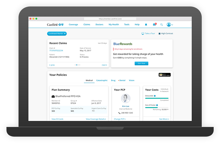
Anxious, you immediately click to see more details about it which shows you the list of all the claims filed so far. You now know that both the claims that have been filed by the same hospital but no further information is available yet because the claims are still being processed. So, you decide to come back later to check more details about what’s going on.

Couple of days later, while your wife and you are driving down to another city to for some work, you see on your smartphone a new email from the insurance company. The email says the claims are now processed and are ready for the payments to be made by you. You tap the link which opens the insurance company mobile app and takes you straight to the billing section of one of the claims to make payment.
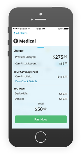
You go on to see the claim details before making payment. Looks like both the claims are related to the same injury but they are different because the treatment was different. The claim lines explain everything in detail about all the procedures, the cost break up, even the discounts received. Pretty neat.

Satisfied with the clarity of the information and ease of finding what was needed you end up making payment for you owe and exit the app feeling relaxed about the task that just got done so easily.

This, arguably the best digital user experience delivered by any health insurance provider in the US, was result of the company’s willingness to take a big step forward and my team’s resilience throughout the process.
The Process
As the sole UX designer on the project, I led the end-to-end design of CareFirst’s customer account experience across web and mobile, taking ownership of both interaction and visual design from discovery through production.
I partnered closely with product, engineering, business analysts, and healthcare subject matter experts to define the UX strategy, information architecture, and scalable design system.
Throughout the project, I regularly collaborated with the UX manager and fellow designers working on related initiatives to review work, exchange ideas, and incorporate feedback through design critiques.
Different Users, Different Expectations
Before exploring solutions, we aligned on a shared understanding of the users, the business, and the product ecosystem through stakeholder workshops, journey mapping, workflow analysis, customer feedback, and competitive research.

Research revealed that CareFirst members naturally clustered into three distinct user groups with vastly different healthcare needs, technology habits, and expectations. These personas grounded the design process, ensuring that every decision balanced the needs of first-time users seeking clarity, experienced members prioritizing efficiency, and older adults who benefited from accessible, confidence-inspiring experiences.
A key insight emerged early: customers fell into two distinct groups.
Frequent users:
Regularly managed claims, payments, and benefits, valuing speed and efficiency.
Infrequent users:
Typically accessed the platform during stressful moments, such as a medical emergency or unexpected bill, where clarity and reassurance mattered far more than speed.
At the same time, the existing experience suffered from fragmented navigation, information overload, and workflows organized around internal business structures rather than customer mental models.
These insights established a clear design objective which is to…
…create an experience that balances efficiency for frequent users with clarity for infrequent users, while making complex healthcare information transparent, easy to navigate, and easy to understand.

The legacy platform buried important information behind cluttered layouts, deep navigation, and fragmented workflows. Organizing content around internal systems instead of customer needs made even routine tasks difficult to complete and undermined user confidence.
Key Insights: Research uncovered four recurring themes.
-
Information Overload: Pages contained large volumes of information with little visual hierarchy, making important content difficult to locate.
-
Low Discoverability: Critical tasks required unnecessary navigation because information architecture reflected internal business structures rather than customer mental models.
-
Lack of Transparency:When information appeared incomplete or difficult to find, users often assumed the company was intentionally hiding details.
Improving transparency became just as important as improving usability.
-
Fragmented Experience: Customers frequently transitioned between email notifications, desktop, and mobile devices while managing a single claim. The experience needed to feel continuous across every touchpoint.
Designing for Clarity, Trust, and Scale
These insights evolved into five product principles that guided every design decision throughout the project.
-
Make complexity understandable: Present information progressively rather than all at once.
-
Prioritize customer goals: Organize experiences around tasks instead of internal organizational structures.
-
Build trust through transparency: Clearly communicate status, financial responsibility, and next steps.
-
Design once, scale everywhere: Create reusable interaction patterns capable of supporting future products.
-
Meet users where they are: Deliver a seamless experience across desktop, mobile web, and native applications.
The factor of cost could not be ignored. To be specific the cost of maintenance of these tools had to be lower in order for the company to pass on that benefit to its customers in the from of lower insurance cost. So, the design will have to be a highly modular and scalable architecture.
Organizing Around Users Needs
One of the most impactful aspects of the redesign was restructuring the platform’s information architecture. Rather than organizing content around business departments, navigation was redesigned around how customers naturally think about managing their healthcare.

Health insurance is inherently complex, but navigating it shouldn’t be. The information architecture was designed around users’ primary tasks rather than internal business structures, creating a flat, scalable hierarchy that improved discoverability, reduced cognitive load, and made related information easy to find across the platform.
Claims, billing, benefits, payments, support, and account management became clearly defined destinations with predictable navigation and consistent interaction patterns. This significantly reduced cognitive load while creating a scalable foundation for future expansion.
We prioritized the redesign based on customer value. The first release focused on two foundational experiences.
-
Dashboard
-
Claims
Together these established the interaction patterns and reusable components later adopted across the remainder of the platform.
Glanceable Dashboard View
The dashboard was designed to give members immediate access to the information and actions that mattered most the moment they signed in. The challenge wasn’t deciding what to show—it was presenting a diverse set of information in a way that was easy to scan, prioritize, and act on without overwhelming users.
To address the challenge, I established a clear information hierarchy that prioritized the most relevant and actionable content above the fold. Previous user studies had showed that…
…while members were comfortable scrolling, they consistently appreciated having high-priority information immediately visible upon landing.
This insight shaped the balance between above-the-fold and below-the-fold content, enabling users to quickly find what they needed while progressively revealing secondary information without overwhelming the experience.

The dashboard’s information hierarchy was driven by user priorities. Frequently accessed information and actionable tasks were placed above the fold for immediate visibility, while secondary content and business-driven promotions were intentionally deferred below the fold. This approach reduced cognitive load and ensured users could quickly focus on what mattered most.
I also introduced a card-based dashboard where each card represented a key area of the customer’s account—such as claims, billing, ID cards, or benefits. Each card surfaced the most relevant information at a glance while providing a clear path to more detailed views, allowing the experience to balance simplicity with depth through progressive disclosure.

The initial concepts prioritized the information members accessed most frequently, using insights from user research and analytics to explore layouts that supported different user goals and contexts.
During concept exploration, the team evaluated several alternative approaches, including a health timeline and a claims-first landing page. While each had merits, usability evaluations and design reviews consistently showed that a modular dashboard provided the greatest flexibility, accommodated the widest range of user needs, and scaled more effectively as the product evolved.
The dashboard also became one of the project’s biggest stakeholder challenges. Different business groups wanted their content featured more prominently, often competing for the same screen space.
Rather than prioritizing organizational interests, I facilitated collaborative discussions that refocused the team on customer goals and usage patterns.
This shifted conversations from who owns the content to what delivers the greatest value to users.
The resulting dashboard established a flexible foundation that could adapt to changing business priorities while consistently surfacing the most relevant information based on user needs.

The final dashboard evolved from an exploratory concept into a production-ready experience that served as the central entry point to the platform. By combining clear information hierarchy, progressive disclosure, and modular design, it enabled members to quickly understand what required their attention and seamlessly navigate to the tasks that mattered most.
The dashboard was built around a modular card architecture that could flex to accommodate different content, priorities, and user scenarios. Like building blocks, card variants could be combined, resized, and rearranged while preserving a consistent visual hierarchy, enabling the experience to scale without sacrificing clarity or usability.

The interface was built on a responsive 12-column grid that optimized both readability and flexibility. Supporting up to four cards per row on desktop, the layout established a scalable foundation that maintained visual consistency, efficient use of space, and a seamless experience across desktop, tablet, and mobile devices.
The platform was designed with a responsive foundation, ensuring layouts and components adapted seamlessly across desktop and mobile devices. Every component was designed to scale from a 1140px desktop viewport to a 320px mobile experience while maintaining consistency and usability.

The mobile experience was designed through adaptation rather than reduction. Each component was restructured to maintain clarity, scan-ability, and ease of interaction on smaller screens. Information hierarchy, spacing, and typography were refined, nested layouts were simplified into linear flows, and non-essential visual elements were removed to reduce cognitive load while preserving functionality.
Although tablet layouts were considered throughout the design process, analytics showed relatively low tablet usage compared to desktop and mobile. Based on this data, the team prioritized optimizing the primary experiences for the most-used devices. Tablet users were initially served the desktop experience in landscape orientation, allowing us to deliver a high-quality experience while focusing design and engineering effort where it would have the greatest impact.
Multi-purpose Claims Module
Claims represented the platform’s most complex workflow. The challenge wasn’t simply displaying information—it was helping customers understand what had happened, what insurance had covered, what they still owed, and what action was required next.

Claims was the platform’s most complex workflow, involving multiple states, related records, and supporting information. By mapping the complete claims lifecycle and dividing the information based on the importance to the users, I created an information architecture that improved discoverability, clarified relationships between data, and helped members confidently navigate every stage of the claims process.
Multiple design concepts were sketched out and validated through interactive prototypes.
The fundamental difference between the concepts was how the information of Claims was organized and laid out on the pages so it delivers on the design strategy.

Early concept exploration focused on finding the right balance between clarity and efficiency. By evaluating multiple layouts and interaction models for both the Claims List and Claim Details experiences, I identified the strengths and trade-offs of each approach before synthesizing them into the final solution.
These concepts demonstrate good breadth of exploration. I worked with the rest of the UX team to evaluate these to determine why each concept existed, what it optimized for, and why it was or wasn’t selected.
-
Split View: Enabled quick claim switching and side-by-side context for power users, but increased visual complexity and didn’t scale well to smaller screens.
-
List View: Offered a clean, familiar, and highly scannable browsing experience, though it required an additional step to view claim details.
-
Parallel Layout: Maximized information visibility by presenting related details simultaneously, but risked overwhelming users with a dense interface.
-
Sequential Layout: Guided users through claim information in a clear, logical flow that was easier to understand, at the expense of requiring more scrolling for detailed comparisons.
Design decisions were continuously validated through usability testing rather than waiting until implementation. Low-fidelity concepts, interactive prototypes, and production-ready interfaces were tested throughout the project. This iterative approach helped us validate navigation, information hierarchy, terminology, and interaction patterns before engineering investment. It also shifted stakeholder discussions from subjective opinions toward evidence-based design decisions.

High-fidelity interactive prototypes were built in Axure and iteratively tested with internal stakeholders and external users. These sessions validated key design decisions around navigation, information hierarchy, and content density, enabling the team to refine the experience before development.
Usability testing demonstrated that users strongly preferred experiences that:
-
exposed key information immediately
-
progressively revealed supporting details
-
explained financial breakdowns clearly
-
reduced unnecessary visual complexity
-
provided reassurance throughout the workflow
These findings directly informed the final interaction model.

The default Claims List was designed for rapid scanning and efficient navigation. Each full-width card highlights key claim information, allowing members to quickly assess status, payments, and other important details before seamlessly drilling down into the complete claim. Claims are displayed chronologically, ensuring the most recent activity is always immediately visible.
One of the most valuable insights from usability testing was that users naturally organized claims in different ways depending on their goals. Rather than forcing everyone into a single workflow, I introduced a view-based Claims List that enabled members to browse and locate claim information from multiple perspectives while maintaining a simple, consistent experience.
Testing with members from Kaiser Permanente, UnitedHealthcare, Anthem, and Aetna revealed overwhelmingly positive reactions to the view-based Claims experience. Several participants remarked that they wished their own insurance provider offered a similar level of flexibility and clarity when navigating claims.

Research showed there was no single way users expected to navigate their claims. Different goals required different perspectives on the same data, so the Claims experience provided purpose-built views that supported common mental models: Calendar for recalling care by date, Cost for tracking financial responsibility and deductible progress, and EOB for understanding how related claims were grouped and processed. This flexible approach improved discoverability without increasing complexity.
The Claims Details page represented the platform’s most complex and high-value workflow. It brought together claim status, financial responsibility, medical services, and payment information into a single experience that users relied on to understand exactly what happened, what insurance covered, and what they owed. Because the page also served as an official record that members could print or save for future reference, clarity and accuracy were essential.
To validate our design strategy, I developed two high-fidelity interactive prototypes in Axure, each exploring a different approach to organizing this complex information. Both concepts performed equally well during usability testing, with participants split almost evenly in their preference.

The two concepts explored different approaches to helping users understand complex claim information. The Sequential Layout guided members through the claim in a logical, step-by-step flow, reducing cognitive load and supporting first-time or infrequent users. The Parallel Layout surfaced key information simultaneously, enabling experienced users to quickly compare costs, coverage, and claim details while exploring sections in any order.
Rather than selecting a winner based solely on preference, the I used some brain power from the rest of the design team and reviewed the findings against our product goals and identified the strengths of each concept. We ultimately chose the Parallel Layout because it enabled users to compare financial information more easily, reduced cognitive effort when calculating out-of-pocket costs, and provided faster access to related information without sacrificing clarity.

The final design transformed a highly complex workflow into an experience that was easy to scan, understand, and navigate. A prominent claim timeline established context upfront, improving transparency throughout the claims lifecycle, while a carefully structured information hierarchy helped members quickly interpret financial responsibility, medical details, and claim activity. When self-service wasn’t enough, contextual support options were always within easy reach.
While the redesigned experience enabled members to complete most tasks independently, research showed that some situations—such as billing discrepancies or missing claims—still required human assistance. In these moments, quick access to customer support became essential for maintaining trust and confidence in the product.
To address this, I introduced a persistent support section that offered multiple contact options based on members’ preferred communication methods. Although some stakeholders were concerned that making support more prominent would increase call volume, usability testing revealed the opposite. Participants consistently treated customer support as a last resort, preferring to exhaust self-service options before reaching out. Making help easy to find didn’t encourage unnecessary calls—it reassured users that assistance was readily available when they genuinely needed it, strengthening their overall confidence in the experience.
Birth of the Multifaceted Design System
As additional modules were redesigned, recurring interface patterns naturally emerged. I led the creation of a modular design system that standardized components, layouts, interaction behaviors, typography, spacing, color, iconography, and responsive patterns.

CareFirst UI Kit was a comprehensive, responsive design system created before “design systems” became common practice. It established reusable components and interaction patterns that scaled seamlessly across desktop, tablet, and mobile, enabling faster design iterations while providing a shared foundation for engineering implementation.
The design system accelerated delivery across teams while ensuring consistency throughout the growing product ecosystem. More importantly, it established a shared language between design and engineering that significantly reduced implementation ambiguity.
Supporting the Development
I worked closely with engineering throughout implementation to ensure the shipped experience accurately reflected the intended interaction model.
This included:
-
defining interaction specifications
-
documenting behaviors and edge cases
-
reviewing implementation builds
-
providing design QA
-
resolving implementation constraints collaboratively
Maintaining close collaboration throughout development reduced rework while improving overall product quality.
Outcome
The redesigned customer account experience launched across responsive web and mobile platforms, establishing a modern, scalable foundation for CareFirst’s digital ecosystem.
The new experience simplified complex healthcare workflows through clearer information architecture, intuitive navigation, progressive disclosure, and a reusable design system. It enabled members to manage claims, billing, payments, and account information with greater confidence while providing the organization with a scalable framework for future product development.
The impact extended beyond the interface itself. The project helped establish a more user-centered product development process, where design decisions were guided by research, iterative prototyping, and continuous usability testing.
User feedback consistently reinforced that the redesign met its primary goal—making a traditionally complex and stressful experience feel clear, approachable, and trustworthy.
“I wish my health insurance company had a similar website.”
“I love the layout—extremely user friendly. The sections are clear, and the navigation makes a lot of sense.”
“Everything makes perfect sense. Even someone using it for the first time would be able to figure it out easily.”
“Very clear and easy to navigate—plain and simple without too much unnecessary information.”
While the platform modernized the customer experience across web and mobile, its lasting impact was creating a scalable UX foundation that balanced user needs, business goals, and long-term product evolution.
Reflection
This project reinforced an important lesson that continues to influence how I design products today.
Users rarely struggle because information is inherently complex—they struggle because products fail to present complexity in ways that match human expectations.
The most valuable outcome wasn’t simply a redesigned interface.
It was creating a scalable product foundation that balanced customer needs, business objectives, engineering constraints, and long-term maintainability.
That systems-oriented approach continues to shape how I design complex SaaS platforms, enterprise products, and connected experiences today.