Maytag Connected Laundry Experience
Mobile App for iOS and Android Devices

Transforming Maytag’s smart appliance experience from a basic remote control into an intelligent laundry companion.
Challenge
Customers were paying a premium for Maytag smart appliances but weren’t experiencing enough value to justify the investment. The mobile app received poor ratings, engagement was low, and connected appliance adoption had stalled.
I led the UX redesign of the Maytag Smart Appliance mobile experience, transforming it from a basic remote control into an intelligent companion that simplified laundry throughout the day.
Outcome & Impact
Launched in 2021, the final design empowers users with real-time status updates, personalized usage tips, and context-aware controls—making laundry more convenient, efficient, and tailored to individual needs.
The redesigned experience significantly improved both customer satisfaction and business performance.
Customer Experience:
-
App Store rating increased from 1.5 → 4.5
Product Adoption:
-
Connected appliance install base increased 193%
Engagement:
-
Connected cycles increased 53%
-
Actionable notifications increased 170%
-
Voice command usage increased 716%
-
October 2021 became the highest-engagement month in the product’s history.
The redesign became the foundation for the next generation of Maytag’s connected appliance ecosystem and contributed to significant improvements in customer engagement and connected appliance adoption.
At a Glance
Role: Lead UX Designer
Platform: iOS & Android
Timeline: 18 months
Team: Product Manager, UX Design, Visual Design, Motion Design, Engineering, User Research, Marketing
The Experience
It’s Sunday morning when you get a notification from the Maytag app: “It’s laundry time.” You gather clothes from around the house, sorting them carefully — bedding in one pile, everyday clothes like jeans and towels in another, and delicate, high-quality fabrics in their own stack to protect their feel and longevity.

You decide to start with bedding. After loading the washer, you select the appropriate cycle from the machine’s UI and head to the kitchen.
About 45 minutes later, your phone buzzes: “Wash Cycle Complete.” You transfer the bedding to the dryer, set the drying cycle, and load the washer with regular clothes before leaving.
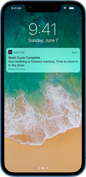
An hour passes without a notification. Curious, you open the Maytag app and see the wash is in its final spin with only 2 minutes remaining. That lets you time it perfectly — you head to the laundry room just as the washer stops, transfer the load to the dryer, and load the delicates.

For these delicates, you’ve already created a custom cycle in the Maytag app called Soft Wash. You select it from the app and start the wash remotely before leaving to pick up your kids.

Later, while chatting with other parents, your phone pings again: the Soft Wash cycle has finished. Knowing you’ll be running errands for a few more hours, you remotely start the Fresh Hold cycle from the app to keep clothes fresh until you get home.

When you finally return, you hear the washer humming in Fresh Hold mode. You cancel it, transfer the delicates to the dryer, and feel confident that everything was washed exactly how you wanted — without being tied to the laundry room all day.
The Process
I owned the end-to-end UX strategy and interaction design.
My responsibilities included:
-
Product discovery
-
User research synthesis
-
Experience strategy
-
Information architecture
-
Interaction design
-
Wireframes
-
Usability testing
-
Design specifications
-
Cross-functional collaboration with Product, Engineering, Marketing, Motion Design and Visual Design
Problem of Oversimplification and Inefficiency
Rather than immediately redesigning the interface, I first wanted to understand why customers stopped using the existing app.

The existing design was just a blue colored version of the yellow Whirlpool app.
I synthesized insights from:
-
Customer support
-
Product marketing
-
App Store reviews
-
Competitive analysis
-
Five years of appliance research
-
Usage analytics
A clear pattern emerged.
Customers weren’t asking for more features.
They wanted the existing features to fit naturally into their everyday routines.
The product behaved like a remote control.
Users expected an intelligent companion.
That insight fundamentally changed the direction of the project.
Design Principles & High Level Experience Goals
Instead of beginning with screens, we established experience principles that guided every design decision.
-
Make the app useful every day: The app should provide value whether or not users are actively doing laundry.
-
Complement the appliance: The phone should extend the appliance—not duplicate its interface.
-
Reduce cognitive load: Important information should always be visible at a glance.
-
Encourage engagement: Every interaction should reinforce the benefits of owning connected appliances.
-
Design for the future: The architecture needed to scale as new appliance capabilities were introduced.
Designing for Real Life
One observation became central to the redesign.
People don’t do laundry.
They do everything else while laundry happens.
The experience therefore became less about controlling appliances and more about helping people manage laundry around their daily lives.
Examples include:
-
Intelligent cycle notifications
-
Remote Fresh Hold activation
-
Favorite cycles
-
Real-time appliance status
-
Context-aware recommendations
Rather than forcing users to return to the laundry room, the app allowed laundry to fit naturally around work, errands and family.


The user journey served as foundation to the overall app design work for the years to come. It show how users feel at present when they go through various phases of the appliance lifecycle and what could be done to elevate their experience from where they are today to where we want them to be.
While mapping the full user journey was important for long-term design strategy, there was an immediate need for early concepts to set the design direction. I therefore focused on:
-
Primary Use Case – Determining the core laundry workflow to prioritize in the redesign.
-
Hero Experiences – Identifying high-impact interactions and features that would drive recurring user engagement, such as cycle notifications, custom cycles, and remote control capabilities.
This approach ensured that the early concepts were grounded in real user behavior while aligning with business goals and design principles, providing a clear foundation for the next stage of design execution.
Appliance + Mobile Ecosystem
One of the most important decisions throughout this project wasn’t how to design the mobile application—it was deciding where each interaction belonged.
A connected appliance is more than a mobile app. The experience spans physical hardware, embedded interfaces, cloud services, and the user’s phone. Designing each part independently would have resulted in duplicated functionality and unnecessary complexity.
Instead, I approached the washer, dryer, and mobile app as a single connected ecosystem.
The appliance remained the best place for immediate, hands-on tasks, such as selecting a wash cycle, starting a load, or making quick adjustments while standing in front of the machine.
The mobile app extended that experience beyond the laundry room by supporting tasks that naturally happen when users are elsewhere in their home—or away from home entirely.
A guiding design principle:The appliance should be optimized for tasks users perform while standing in front of it. The mobile app should be optimized for everything they need when they’re not.
This principle influenced numerous design decisions around what experience is delivered where.
On-appliance experience:
-
Select and start wash cycles while loading clothes
-
Immediate physical controls
-
In-the-moment cycle adjustments
-
Essential operational information
-
Local appliance interaction
Mobile experience:
-
Monitor cycle progress from anywhere
-
Receive intelligent notifications
-
Start Fresh Hold remotely when unable to unload clothes
-
Save and launch favorite cycles
-
Access appliance history, tips, and educational content

This separation reduced duplication between the appliance and the mobile experience while ensuring each platform focused on what it does best.
Rather than treating the phone as a remote control, the redesign positioned it as an intelligent companion that keeps users informed, reduces unnecessary trips to the laundry room, and helps laundry fit naturally into everyday life.
This systems-level approach became a guiding principle throughout the project, influencing the information architecture, interaction patterns, notification strategy, and feature prioritization across the entire connected experience.
Architecting for Ease and Efficiency
Research showed that users primarily opened the app to answer three questions:
-
Is my appliance running?
-
How much time is left?
-
Do I need to do anything?

The preliminary version of the information architecture focuses on high-level information classification and includes detailed coverage of the Appliance module, which was identified as the high-engagement area based on primary use cases.
Rather than organizing the app around features, I redesigned the information architecture around these user needs. The landing screen prioritized appliance status, remaining time, and the next most relevant action, while making secondary information accessible with a single tap.

The figure shows first draft of the appliance module information architecture organized based on the importance of the information.
To ensure the interface remained simple without sacrificing functionality, I categorized content as Critical, Essential, and Optional, creating a clear hierarchy that guided every screen layout. I also adopted a flat, tab-based navigation model to minimize navigation depth and improve discoverability.
This structure reduced cognitive load, improved task efficiency, and established a scalable foundation for future features across the connected appliance ecosystem.

The first figure shows tabbed navigation pattern anchored to the bottom of the viewport going users easy access to all core modules of the app. The second figure shows the division of the page in three sections that’ll be assigned to the different type of content based on how the hierarchy of the information.
Design Exploration
Exploring the Right Experience
Rather than committing to a single solution, I explored four distinct concepts for the app’s highest-engagement screen—the Appliance Overview. Each concept experimented with different approaches to information hierarchy, appliance layout, and quick access to frequently used actions.
After internal design reviews, two concepts emerged as the strongest candidates. Instead of selecting a direction based on design preference alone, I built interactive prototypes and conducted usability testing to understand how real users interacted with each experience.

These early concepts for the Maytag mobile app’s appliance screen explored different arrangements of appliances and varied approaches to accessing favorite or recently used cycles.
Why Concept D Won
Concept D consistently outperformed the alternatives because it aligned more closely with users’ mental models and everyday workflows.
Users appreciated that it:
-
Surfaced the most important information immediately.
-
Balanced information density without feeling cluttered.
-
Reduced the number of taps required to access common actions and favorite cycles.
-
Made navigation feel simpler and more predictable.
The findings gave the team confidence to move forward with Concept D, providing a research-backed foundation for the final experience rather than relying on subjective design opinions.
Design Down-Selection
Validating the Design
Before committing to a final direction, I conducted a comparative usability study using interactive prototypes of the two strongest concepts.
Working with the market research and brand teams, I recruited participants representative of Maytag’s target customers and designed a series of realistic tasks, including checking appliance status, setting a wash cycle, monitoring progress, and accessing common actions.
The study focused on evaluating:
-
Information hierarchy and discoverability
-
Navigation clarity
-
Task efficiency
-
Overall user preference

The figure illustrates the navigation flow between the Appliance Overview page and the Appliance Details page as implemented in the prototypes. Two different concepts of the Appliance Overview page share a single concept of the Appliance Details page, which can exist in two distinct states. These designs also would also serve as template for other screens which will cover many other scenarios for the same use case.
Key Findings
Concept D consistently outperformed the alternative.
Participants found it easier to understand at a glance, appreciated its balanced information density, and completed common tasks with fewer interactions. The layout aligned more closely with users’ mental models by surfacing appliance status and next actions before secondary information.
The research provided objective evidence to move forward with Concept D and gave the team confidence that the final design decisions were grounded in user behavior rather than personal preference.
Changes informed by the study
• Simplified the Appliance Overview layout to prioritize live status.
• Reduced the prominence of secondary content in favor of frequently used actions.
• Made favorite and recent cycles more accessible to reduce repetitive interactions.
• Refined navigation to better match users’ expectations.
Building a Scalable Design System
As the interaction design matured, it became clear that the app needed more than a collection of polished screens. It needed a reusable system that could scale across future appliances and features while maintaining a consistent user experience.

The figure shows the color palette used for various UI elements in the low-fidelity mockups, along with the intended purpose of each color.
Working closely with the visual design team, I identified reusable UI patterns from the app’s highest-engagement screens and helped translate them into the first version of the project’s design system. Together, we defined the structure, behavior, and visual language of key interface components before expanding them across the rest of the application.

The figure shows annotated mockups of the high-engagement pages, with each UI element highlighted and accompanied by detailed interaction notes.
By standardizing common UI elements and interaction patterns early in the project, we were able to:
-
Create a consistent experience across the app.
-
Accelerate the design of new screens and features.
-
Simplify implementation for engineering.
-
Establish a scalable foundation for future connected appliances.
The design system became the backbone of the product, enabling the team to move from wireframes to high-fidelity designs more efficiently while ensuring consistency throughout the connected appliance experience.
From Wireframes to High-Fidelity Experience
With the design system established, I expanded the approved wireframes into complete high-fidelity user flows.
Working closely with the visual design team, we translated the interaction model into a polished interface that reflected Maytag’s brand while preserving the usability principles established during the UX phase. As visual explorations evolved, I continuously refined layouts, interactions, and information hierarchy to ensure the experience remained intuitive and aligned with the original design goals.

The Figure shows the evolution of the design of Appliances Overview page from wireframe phase to hi-fidelity mockup.
Using reusable components from the design system, I created detailed user flows covering the app’s core experiences—from appliance setup and cycle programming to live status monitoring, notifications, and remote controls.
These high-fidelity prototypes became the foundation for stakeholder reviews, usability validation, and ultimately the detailed design specifications delivered to engineering.

These are the designs that were produced with the help of style guide and first draft of the design system and were presented these to the leadership.
-
Consistent interactions: Reusable patterns ensured users encountered familiar behaviors throughout the app.
-
Scalable foundation: New appliance features could be introduced without reinventing the experience.
-
Production ready: The flows served as the basis for engineering specifications and implementation.
Engineering Collaboration
Designing a great experience didn’t stop at the interface. Throughout the project, I worked closely with engineering to ensure the experience could be implemented efficiently, scale over time, and remain faithful to the design intent.
I view engineering as a design partner, not a handoff point.
As the product evolved, we recognized that updating the user interface often required unnecessary backend changes, making future iterations slower and more complex. To improve long-term flexibility, I collaborated with engineers to explore a more modular approach that separated the presentation layer from backend implementation.
Together, we developed a proof of concept demonstrating how reusable UI components and standardized interaction patterns could support future features while reducing implementation effort. Rather than rebuilding the entire application, the new architecture was introduced incrementally on the app’s highest-engagement screens, allowing the team to validate the approach without impacting delivery timelines.

Example high-fidelity user flow illustrating key interactions across one of the app’s core experiences. Similar end-to-end flows were created for all major user journeys and served as the foundation for stakeholder reviews, engineering specifications, and implementation.
Throughout development, I partnered with engineers to review implementation, clarify interaction details, and deliver comprehensive design specifications, ensuring the shipped experience closely matched the original design intent.

The figure presents screenshots of the design file’s sidebar, showcasing the structured organization of specifications. This approach was praised by both developers and stakeholders for its clarity and ease of navigation, streamlining collaboration throughout the project.
This collaboration established a scalable foundation for future development while enabling faster iteration and a more consistent connected appliance experience.
Shipping the Experience
Following iterative design, usability testing, and close collaboration with visual designers and engineering, the redesigned Maytag Smart Appliance experience was launched on both iOS and Android.
The shipped product closely reflected the original experience vision, bringing together intuitive interactions, a scalable design system, and a cohesive visual language that reinforced Maytag’s premium connected appliance experience.

The Maytag website announced the app, emphasizing its advantages when used with Maytag smart appliances.
From appliance setup and cycle programming to real-time monitoring, notifications, and remote controls...
...the final product remained faithful to the original experience vision and design principles established at the beginning of the project.
The successful launch marked the foundation for the next generation of Maytag’s connected appliance ecosystem
Impact
The redesigned Maytag Smart Appliance app launched on iOS and Android in early 2021, delivering measurable improvements in customer satisfaction, engagement, and connected appliance adoption.
Customer Experience
App Store rating increased from 1.5 to 4.5 stars within the first year, reflecting a significantly improved user experience.
Product Adoption
193% increase in the connected appliance install base, demonstrating stronger adoption of Maytag’s smart appliance ecosystem.
User Engagement
-
53% increase in connected wash and dry cycles initiated through the app.
-
170% increase in actionable notification interactions, helping users better manage laundry remotely.
-
716% increase in voice command usage, indicating growing adoption of advanced connected features.
-
Record-breaking engagement across key in-app actions within the first year following launch.
Where do the numbers come from? Metrics provided by Whirlpool product analytics and measured within the first year following launch.

The Maytag app on the iOS App Store has experienced a surge in downloads immediately after the launch and has received overwhelmingly positive ratings, significantly surpassing the previous version that had only a 1.5-star rating.
Beyond the product metrics, the redesigned experience was selected for Whirlpool’s annual Board of Directors showcase, where interactive prototypes were presented to executive leadership, highlighting the strategic direction of the company’s connected appliance ecosystem.
The project demonstrated how a thoughtful, user-centered redesign can improve customer satisfaction, increase engagement with connected features, and strengthen the overall value proposition of a smart home product.
Learnings
This project reinforced that great connected experiences are not created by simply extending hardware controls onto a mobile device. They emerge from understanding the strengths of each platform and designing them to work together as a cohesive ecosystem.
It also demonstrated the importance of validating design decisions early. By grounding key interaction patterns in research and usability testing, the team was able to align around evidence rather than opinion, resulting in greater confidence throughout development.
The best connected experiences don’t ask users to adapt to technology—they quietly adapt to the way people already live.
Finally, the project highlighted that successful product design extends well beyond creating intuitive interfaces. Building scalable systems, partnering closely with engineering, and maintaining design quality through implementation were equally important in delivering a cohesive user experience.
These principles continue to shape how I approach product design today—balancing user needs, technical constraints, and long-term scalability to create experiences that are both intuitive and impactful.